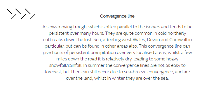
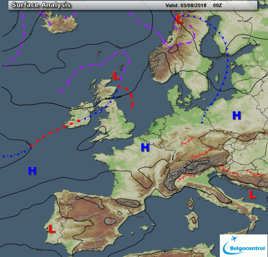
Convergence lines are places to avoid.
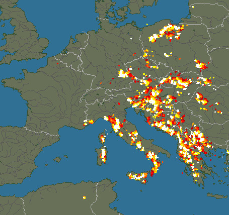
That’s an interesting comparison with the UKMO chart for the same time, which shows almost nothing there!
Well, it shows the one trough (Yugoslavia), and one ex UKMO guy told me if you stuck 10 of them in a room you would get the troughs drawn in 10 different ways.
On the Belgian Met charts, convergence lines are show more often than on others, the forecaster seems to make a point of it. Usually it is a place where all the worst weather hangs in there for a while.
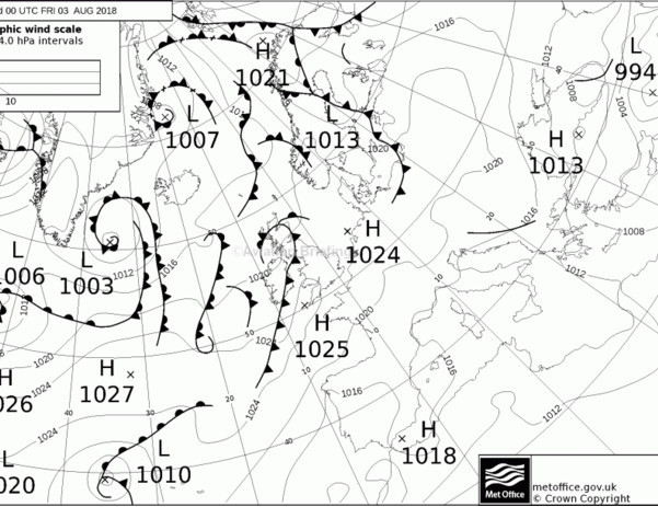
What is this?
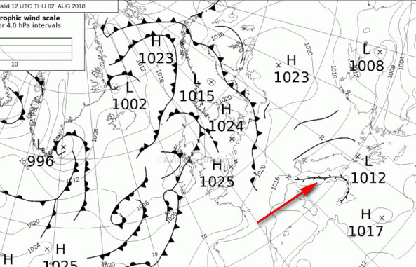
The effect is the usual one