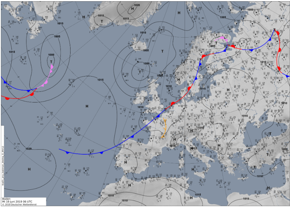
This is 0600 today
What do you make of this?
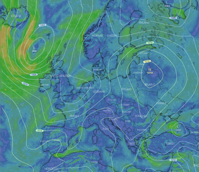
For comparison, this is windy.com ICON
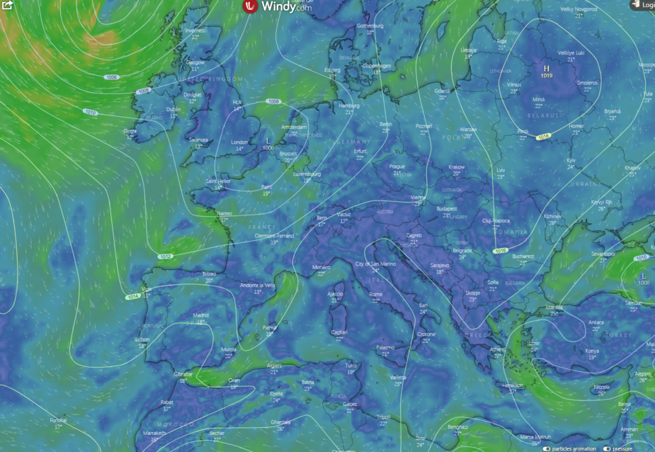
and this is windy.com ECMWF
I 100% prefer the DWD one, since it is
But then I don‘t use MSLPs for my weather briefings much.
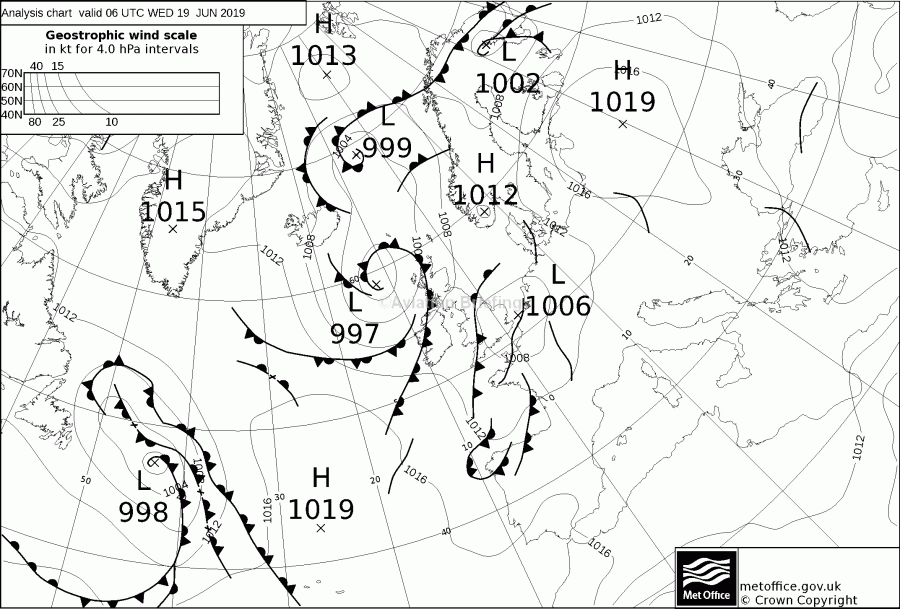
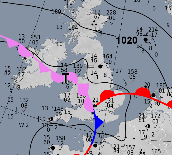
My Q is why so different? The fronts are depicted very differently. And the DWD one shows no troughs which are key to showing convective wx (basically a PROB30 TEMPO TSRA).
BTW, in case someone is concerned that a DWD chart has been leaked from behind their paywall, this one is free here. It appears to be the only free chart from DWD.
I wonder if @mooney_driver has an idea…
And another comparison: 0000Z 21 June
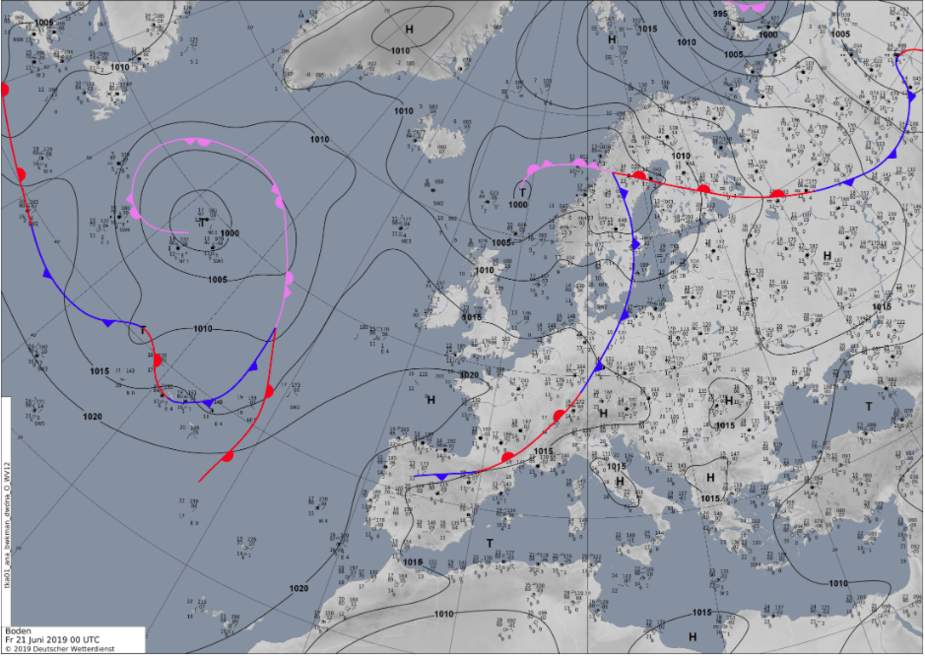
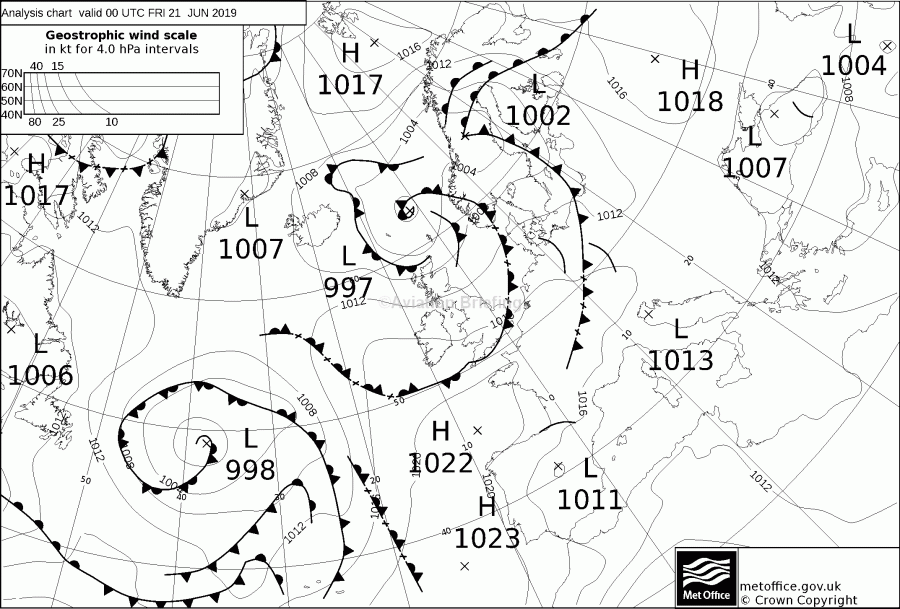
What surprises me is not only are the fronts quite different (they are human-drawn) but the isobars are substantially different too, which is curious since these should be more consistent, perhaps? And as before the DWD one shows no troughs. @bookworm, if he is still around these days, might have an idea.
Incidentally, DWD do offer future MSLP charts, via this

They are not that different. Even if it is difficult to compare them due to the weird projection of the UK chart.
There are diffferences primarily in how they are done.
The isobars are different to a large extent because the DWD one is in steps of 5, the British one in steps of 4. That does not look like much,but if you look at the individual numbers, they are not the same. And it is well possible that due to that, the isobars change position in certain places. Then possibly the used stations to determine the isobars may not match 100% too.
The fronts are in the eye of the meteorologist. There are those who try to keep the chart simple and clean and those who will put more fronts. There are worse examples than the UK ones, especcially machine made ones, and there are worse. Personally I use the DWD analysis as well as the prognosis charts as they are in my opinion the more functional and clean charts. Also I find that the DWD charts correspond to most model outputs whereas the isobars of the UK chart due to but not only due to their different units often have a life of their own.
The projection seems identical to me but they are centred on different places on the globe.
Is there a definition for a front or a trough?
Troughs are highly indicative of convective wx so I wonder why they are not presented?
The orientation of the DWD chart makes it so much easier to read
Peter_Mundy wrote:
The orientation of the DWD chart makes it so much easier to read
Agreed. The projection of the British charts is terrible. DWD are far better and use basics like colouring to improve readability.
Interestingly, looking at the DWD images, the first image is 4MB (!) and the others are ~250k.
The first one has tons of mysterious detail on it e.g.
It looks like PIREPs to me, but I might be wrong.