Looks good in Chrome OS (and Chrome browser)
A few more changes were done yesterday.
I think it looks good.
Very good. Will be my fixed setting from now. I find I use dark theme increasingly in all apps where it is available.
David went live with the fixes last night.
It’s even better now with the new colors
Looks great!
Some feedback:
1. I would prefer a slightly darker background. OLED screens are really good at turning off their LEDs and being pitch black.
2. The text in the upper right menu and search bar could use bright letters to increase the contrast to the background.
Here I replaced: #333 → #000 and #555 → #111. Also, #aaa → #555 could be nice in the search bar (not in the pic below).
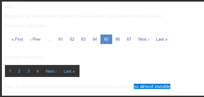
I like it
Might only be Firefox but it doesn’t show you which page of the thread you’re on
Normal is highlighted

but dark mode isn’t
Also, in the preview before posting the text has very low contrast so almost invisible:
Any feedback, anyone?
Thank you. It is important for anyone interested to test this and report any issues. It is done with CSS and that always needs tweaking.
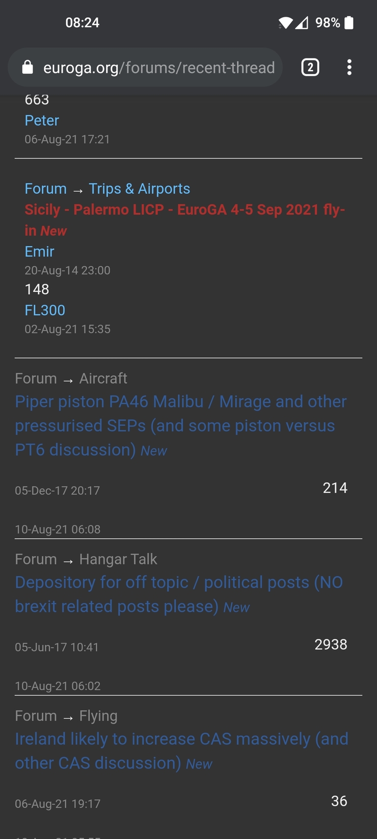
I do like the dark mode but i have found a small bug, the names of the threadstarter and the last reply are missing (or blended in the background)
I hope the screenshot comes through